Animated Mobile Menu

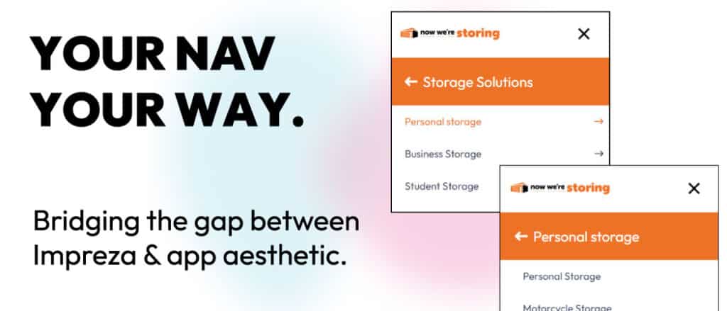
Personal storage app interface for custom storage solutions.

What does it do?

The Impreza mobile navigation options are simultaneously improving and remaining fairly antiquated in terms of their functionality and customisation capabilities.

Our plugin bridges the gap between the currently available colour & typography options within the header builder and its Navigation element, and a more modernised approach to mobile navigation. Wow your next customer with a stand-out navigation that breaks the mould of typical WordPress sites.

Why did we build it?

With apps leading the charge in mobile usage, our aim was to produce a plugin that would allow users to have a more “app-based” experience, while not affecting the UI of Impreza’s core functionality.

What are the use-cases?

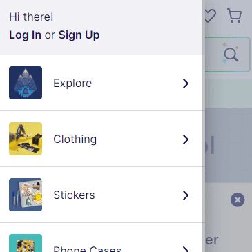
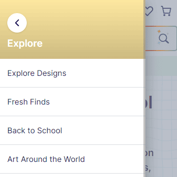
RedBubble is a fantastic example of the use-case for this. The mobile navigation (below) shows the relevant categories (with an image/icon) and then clicking into it reveals a beautifully crafted second level “panel” showing the options within that “dropdown”.
How does it work?

The plugin hooks into the existing header builder, duplicates the “Navigation” element, and re-inserts itself as a new element to add in the header builder. This offers total flexibility in choosing your mobile navigation options, and has it’s own color/typography settings, standalone to the primary “Navigation” element.

What can I expect from this plugin?

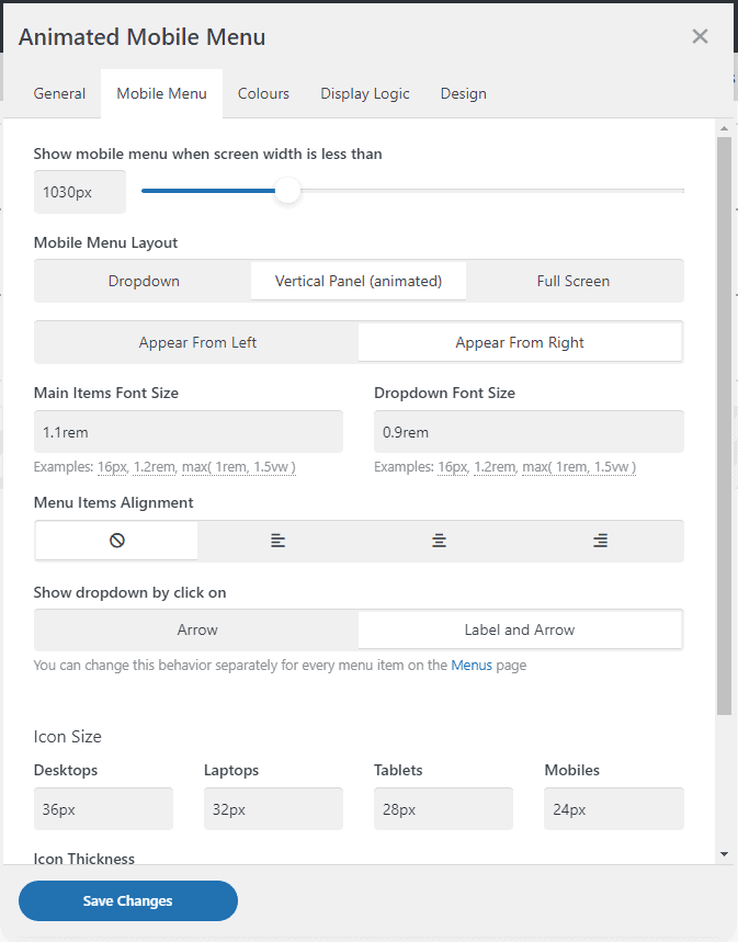
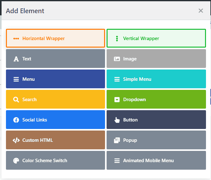
We have tried to make the plugin as user-friendly as possible. Simply install the plugin, and head to your header builder interface (Impreza -> Headers). Add a new element, and look for “Animated Mobile Menu”.

Professional web design services by The Web Alchemist in the UK. Custom websites to boost your online presence.

While the styling, by default, is primarily skeletal, the plugin was designed specifically create the necessary DOM architecture to facilitate some great customisation. Simply add your own custom styling to the various elements to create aesthetically fantastic mobile navigation.

Some FAQs

Assuming Impreza is installed, it’s as simple as just uploading the AMM plugin, entering the license key and you’re good to go. Once installed, a new “Animated Mobile Menu” widget will appear in the header builder. This is your gateway to an improved mobile UX.

While we’ve kept the styling to a minimum (to allow you to do your thing), below is an example of some simple CSS to make the section headings a little less “bland”:

.animated-mobile-menu-title {
    display: block;
    background: var(--color-content-primary);
    font-size: 1.5rem;
    color: white;
}

With the above, your section titles will show in “blocks” rather than just text, with a bit of background colour in place to help them stand out.

Yep, no problem. All the arrows are added using FontAwesome, so you can tap into the ::before and change the “content” declaration in CSS.

Absolutely. In our demo, we have added a reusable block at both top level and 4th level positions so you can see how this will look. The typical Impreza options for the navigation elements will apply.

If you’re looking for a “how to” guide on using reusable blocks in your navigation, refer to this article.

Yep, the plugin does not strip HTML tags from the menu item titles, so you can still add bespoke markup to your menus as normal.

While the plugin functionality will, in most cases, work “out-of-the-box”, some customisation will go a long way. The new AMM header builder element houses it’s own colour set, so you’ll need to specify colours for it. You’ll also likely want to add some custom styling to the title sections, maybe move the arrows over to the right or similar.

This is all achievable in pure CSS, which is exactly the point of the plugin. No faffing with JavaScript/PHP to get the desired effect. Simple HTML architecture to style as you wish.


Get your copy today